


Colour serves as a powerful communication tool, a non-verbal signal that can subtly sway user behaviours and decisions. Its capacity to elicit emotional responses and cognitive biases is crucial for product designers, particularly in the rapidly-evolving Internet of Things (IoT) industry. Let’s dive deep into how the thoughtful use of colour can transform user engagement, efficiency, and satisfaction in IoT products.
The Power of Colour in Driving User Behaviour
A substantial body of research underlines the role of colour in driving user behaviour. Studies have shown that colour can influence perceptions that are not obviously related to colour (Elliot & Maier, 2012). For instance, researchers found that red on a physical or digital object can intensify a user’s attention to detail, while blue can enhance creativity.

Colour Coding in Intuitive Interfaces
In an IoT context, colour can be utilised to create more intuitive interfaces. For instance, smart home technology company Nest uses the colour blue in its thermostats to indicate cooling and orange to indicate heating, tapping into widely-held associations of blue with cold and orange with heat.
This instinctive colour coding helps users understand their devices more quickly, leading to increased efficiency and engagement.
Introducing ‘Colour Nudging’ in IoT
One distinctive approach to colour usage in IoT is the concept of ‘colour nudging’. A nudge is an indirect suggestion or subtle element of design that alters people’s behaviour in a predictable way, without forbidding any options or significantly changing their economic incentives (Thaler & Sunstein, 2008).
Applying this concept to colour in IoT design involves manipulating colour variables to guide user behaviour subtly and positively.
Colour Nudging in Action: Real-World Examples
Here’s a practical example: The Philips Hue smart lighting system uses a spectrum of colours to influence mood and behaviour subtly. Warmer colours are used in the evening to promote relaxation and sleep, while cooler, brighter colours are used in the morning to stimulate alertness and productivity.
This IoT system integrates the natural physiological responses to colour into its design to enhance user wellbeing and engagement.

Interplay of Colour and Visual Hierarchy in IoT Design
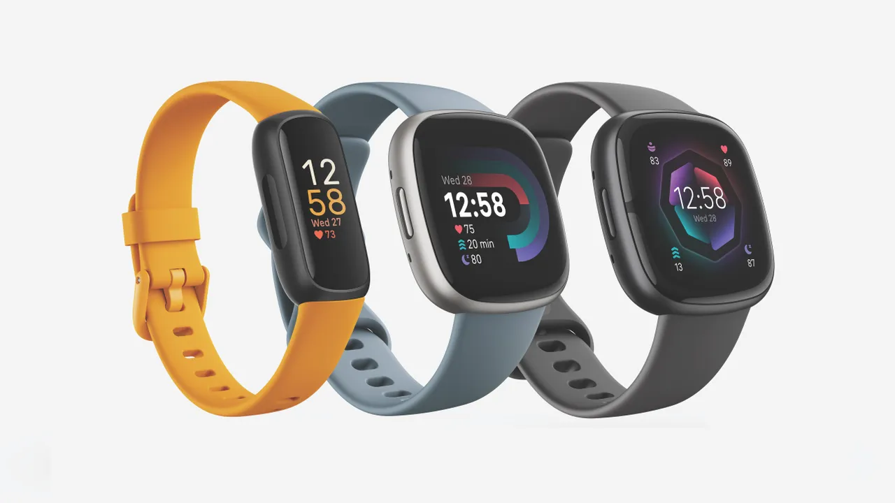
Similarly, fitness wearable companies have started experimenting with colour nudges. Many devices now use colour-coded visual cues to signify certain activity levels. Vibrant, energetic colours like red and orange are used to encourage more intense physical activity, while cooler colours like green or blue represent a more relaxed state.
This colour nudge provides a subliminal motivational factor, pushing users towards healthier behaviours.
As designers expand the use of colour nudging into the myriad applications of IoT, they also need to carefully consider the interplay of colour with other visual elements. The overall visual hierarchy plays a significant role in how colour nudges are perceived and their effectiveness. In many cases, the power of colour could be amplified or diluted by the surrounding visual context, such as the shape, size, or position of a coloured element.
Understanding the dynamics of colour interaction and visual hierarchy becomes especially vital in IoT designs with complex interfaces or numerous elements.
The Challenge of Connected Car Systems
Consider the case of connected car systems. Visual cues are often used in conjunction with auditory cues to alert drivers to potential hazards or system updates. A colour nudge here – for instance, the change from a calm blue to an urgent red on the heads-up display – can serve to heighten driver awareness.
However, the impact of this colour change might be overlooked if not adequately emphasised within the visual hierarchy. Hence, the designer’s challenge lies in balancing the colour nudge with the need for non-distracting, safe interactions, especially in high-stakes IoT applications such as these.
Universal vs. Learned Colour Associations
Another essential consideration for designers lies in understanding the distinction between universal and learned colour associations. While certain colour associations appear to be somewhat universal – for instance, the linkage of red to danger or alertness – many others are learned and can differ substantially among users.
IoT devices often find application in diverse settings worldwide, and what works as a successful colour nudge in one culture or age group might not necessarily translate across to another.
Prioritising Accessibility in Colour Nudging
Moreover, accessibility is a critical component in effective IoT design. Designers must ensure that colour nudges are not the sole means of conveying important information, considering users with colour vision deficiencies. Supplementing colour cues with other sensory cues or designing for colour contrasts that are discernible to users with common forms of colour blindness ensures the IoT device remains inclusive and accessible.
Personalising Colour Nudges: The Future of IoT Design
With the advent of AI and machine learning, there are exciting opportunities to personalise colour nudges based on user preferences and behaviours. An IoT device could learn a user’s individual colour associations over time and adjust its colour cues accordingly, leading to a highly tailored user experience.
This personalisation could increase the effectiveness of colour nudging significantly, adding another layer of engagement to the IoT device.
The Crucial Role of Cultural and Contextual Understanding
The key to leveraging colour nudging effectively lies in understanding its cultural and contextual variations. Remember, colour perceptions can vary widely across different societies and cultures. For instance, while white signifies purity and peace in Western cultures, it is often associated with mourning in many Asian cultures.
Hence, designers must incorporate comprehensive cultural understanding when applying colour nudges to IoT devices for diverse, global user bases.

Preventing User Desensitisation to Colour Cues
Designers should also be cautious of potential user desensitisation to colour cues over time. Repetitive colour nudging can lose its impact if not used judiciously. A well-balanced and dynamic colour strategy can maintain user interest and prevent this saturation effect.
Concluding Thoughts: The Power of Colour Nudging in IoT
In conclusion, IoT product designers can create more effective and engaging devices by understanding and applying colour psychology. The concept of colour nudging represents an innovative, nuanced application of this principle. It presents an exciting opportunity to subtly guide user behaviours towards desired outcomes, enhancing user experience and product value.
As with any design strategy, thoughtful application and user-centred understanding are key to leveraging the full potential of colour in the vast, interconnected world of IoT.


