You can spot an Apple product from across a room. Not because of the logo - you probably can't even see it from that distance, but because of the aluminium, the curves, the way everything just looks…well, Apple. That's visual DNA.
A lot of companies don't have this. They launch three products that supposedly belong to the same brand, but they look like they were designed by three different teams who never spoke to each other. One's glossy black plastic, another's brushed metal, and the third looks like it time-travelled from 2005. Customers get confused. Retailers don't know how to display them. The brand doesn't really feel like a brand at all.
This is the challenge facing anyone who's moving beyond a single product into a range. Creating a cohesive product family isn't just about making things look pretty—it affects everything from customer trust to manufacturing costs. Get it right, and your products become instantly recognisable. Get it wrong, and you're essentially starting from scratch with every new launch.
Visual DNA is the set of design characteristics that make your products unmistakably yours. The genetic code that runs through your entire product range, creating family resemblance even when the products serve completely different purposes.
It's built from several core elements. Form language is the foundation—the curves, angles, and proportions that define your products' shapes. A company might favour soft, organic curves while another goes hard and angular. These choices aren't arbitrary; they communicate something about what the brand stands for.
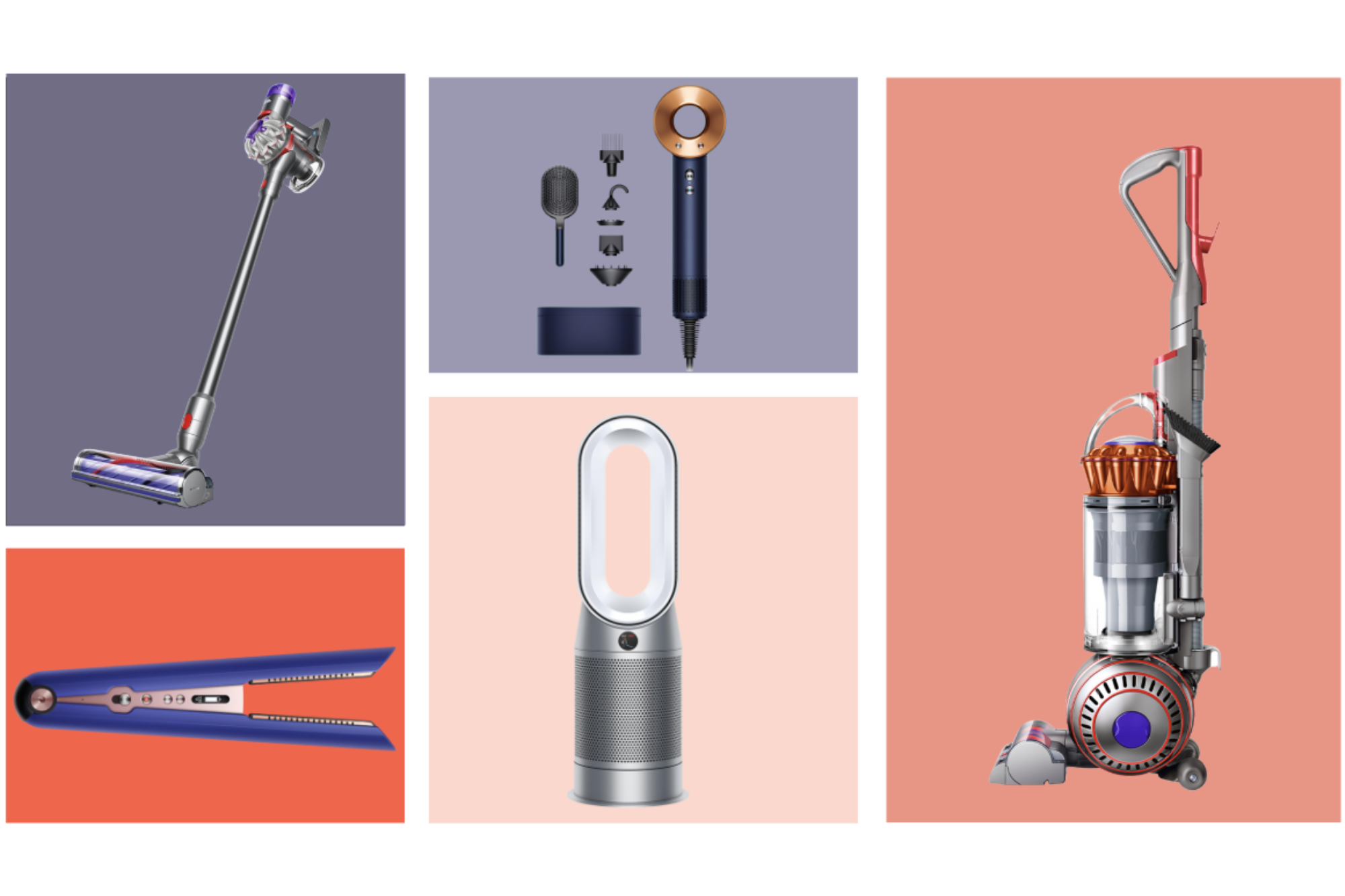
Materials and finishes play a huge role too. Dyson's transparent polycarbonate isn't just a design flourish—it's become part of their identity, showing off the technology inside. Colour strategy matters as well. Some brands stick to monochrome palettes for a premium feel, while others use bold accent colours as signature elements.
Then there are the smaller details that often make the biggest impact: the style of buttons and controls, how interfaces are laid out, the way panels meet and seams are handled, even the typography used on the product itself. These signature details become the "tells"—the subtle cues that help people identify your products at a glance.
What visual DNA isn't, though, is just slapping your logo on everything and calling it a day. That's branding, sure, but it's surface-level. Real visual DNA runs deeper, creating recognition even before someone's close enough to read the badge.
There's a reason the biggest brands obsess over design consistency, and it's not just aesthetic perfectionism.
Brand recognition becomes almost effortless when your visual DNA is strong. Customers don't need to see your name to know it's your product. This cuts through the noise in crowded markets and reduces the marketing spend needed to establish each new product. When someone already trusts your existing products, that trust transfers automatically to new additions to the family.
Perceived value gets a massive boost from cohesion. Products that clearly belong together signal professionalism and attention to detail. They suggest a company that knows what it's doing, that has a vision and the capability to execute it consistently. This perception of quality often justifies premium pricing—people will pay more for products that feel part of a considered, well-designed ecosystem.
Customer confidence grows when expanding into new categories feels natural rather than jarring. If someone loves your first product and then sees you've launched something new that shares the same design language, there's an immediate sense of familiarity. They already understand how to interact with it, what quality to expect, and whether it fits their needs.
Take Dyson as an example.
Their cyclone technology started in vacuum cleaners, but that distinctive transparent cylinder and bold colour blocking now appears across fans, air purifiers, hair dryers, and hand dryers. When they launched the Supersonic hair dryer—a completely different product category—it was unmistakably Dyson. Customers who'd never considered spending £300 on a hair dryer suddenly saw it as a logical extension of a brand they already trusted. That's powerful.
There are practical advantages too. Shared design elements often mean shared components, tooling, and manufacturing processes. This drives down costs and speeds up development time for subsequent products. Retailers appreciate cohesive ranges because they're easier to merchandise and create stronger shelf presence. A wall of products that clearly belong together commands more attention than a scattered collection of unrelated items.
Some brands have turned visual DNA into an art form. Looking at how they've done it reveals patterns worth studying, though not all of them are equally impressive if we're being honest.
The obvious starting point because they've made design consistency a core part of their business strategy. The aluminium unibody construction that debuted with the MacBook now defines everything from iPhones to Mac Studios. Those chamfered edges, the precise way materials meet, the restrained colour palette of space grey and silver—these elements scale seamlessly from a device you hold in your hand to one that sits on your desk.
Even their packaging follows the same visual rules. You could argue Apple's visual DNA is so strong that it's influenced an entire generation of consumer electronics design. Whether that's a good thing is debatable—walk into any tech store and half the products look like Apple knockoffs.
They a masterclass in longevity. Dieter Rams' design principles from the 1960s still influence their products today. Clean geometric forms, honest materials that don't pretend to be something they're not, minimal ornamentation, and those distinctive circular controls and grid-based layouts.
A Braun alarm clock from 1987 and a Braun coffee maker from 2024 share unmistakable family traits. This consistency has turned their products into design icons that appear in museum collections. It started as a deliberate strategy to create brand recognition in a competitive market, but it's become something bigger than that.
Built their entire brand around a cohesive design language that works regardless of product size. Every speaker features that fabric grille, rounded rectangular forms, and a strictly monochromatic palette. Whether it's a compact Roam or a full-sized Arc soundbar, the family resemblance is immediate.
This consistency has helped them compete against tech giants with far larger marketing budgets—their products are simply recognisable in a way that generic smart speakers aren't. Though you could argue they've painted themselves into a corner a bit. Everything looks so similar that it's hard to tell products apart sometimes.
Took a completely different approach in the power tool market. Their aggressive yellow and black colour scheme isn't subtle, but that's the point. On a construction site or in a workshop, you can spot DeWalt tools instantly.
The colour coding extends beyond aesthetics—it signals professional-grade equipment and has become so associated with quality that contractors often buy into the entire ecosystem. The visual DNA here isn't about minimalism; it's about bold, unmistakable presence that builds tribal loyalty. You're either a DeWalt person or you're not.
Each of these brands proves that visual DNA isn't a one-size-fits-all formula. The approach needs to match the brand's personality and market position.
Creating a design language that works across multiple products requires more structure than just "making things look similar."
Look for inconsistencies too—places where products that should feel related actually clash. These gaps reveal opportunities, though they can be uncomfortable to acknowledge.
If "approachable" matters, perhaps softer forms and warmer materials make sense. Making these connections explicit rather than leaving them to chance is what separates brands that have coherent design languages from those that don't.
Develop a colour system with clear hierarchy: primary colours that appear on every product, secondary options for variation, and accent colours for specific purposes. Build a detail library covering everything from how vents are styled to button designs to how logos are applied. This toolkit becomes the reference point for every design decision.
Some elements should stay absolutely fixed (maybe a signature detail or colour), while others can adapt to different contexts. A curved edge might have a 5mm radius on a small product but need to scale to 20mm on a larger one while maintaining the same visual feel.
The product design process needs to have visual DNA baked in from the start, not added as an afterthought. Otherwise you end up retrofitting design language onto products that weren't conceived with it in mind, and it shows.
Products need to feel related without being boring clones of each other. Push consistency too far and your range becomes monotonous. Don't push it far enough and you lose the benefits of having a family in the first place. It's a balancing act.
A useful rule of thumb is the 70/30 split. Roughly 70% of each product's design should draw from your established visual DNA—the core elements that create family resemblance. The remaining 30% can be product-specific, adapting to particular functional requirements or market positioning. This isn't a rigid formula, but it's a helpful starting point for thinking about balance.
The 30% is where you solve unique problems and inject personality suited to each product's purpose. A rugged outdoor product might need more aggressive detailing and robust materials, while a home appliance in the same range could be softer and more refined. As long as that core 70% maintains the connection, the family relationship holds.
Why product styling matters becomes especially relevant here—the styling choices in that flexible 30% can significantly impact how each product is perceived while still maintaining family ties.
Sometimes you need to break the rules entirely. When entering a radically different market or creating a premium sub-brand, strict adherence to existing visual DNA might actually hold you back. Car manufacturers understand this well. Lexus maintains subtle connections to Toyota's design language but elevates everything to signal its premium positioning. The family resemblance is there if you look for it, but it's deliberately understated to avoid diluting the luxury message. Smart move on their part.
Being intentional about when and why you're deviating from your established design language matters. Random inconsistency confuses customers. Strategic variation serves a purpose.
Even with the best intentions, product family design can go wrong in predictable ways.
Over-constraining creativity is surprisingly common. Design systems should enable good work, not straitjacket designers into producing identical products with minor variations. If your visual DNA is so rigid that it prevents solving problems elegantly, it needs loosening. The goal is coherence, not uniformity.
Teams should feel empowered to adapt the design language when function demands it, as long as they're making conscious choices rather than just ignoring the guidelines. Though in practice, this is easier said than done. There's always tension between maintaining consistency and allowing creative freedom.
Forcing DNA onto unsuitable products happens when brand consistency trumps common sense. Not every product you make needs to look like every other product you make. If you're known for sleek consumer electronics and suddenly need to design industrial equipment, trying to apply the same soft curves and glossy finishes might result in something that looks ridiculous or doesn't work. Function must lead. Visual DNA should enhance products, not compromise them.
Ignoring manufacturing realities creates beautiful concepts that can't actually be made. Or worse, they can be made, but at costs that destroy your margins. That signature detail that works perfectly on an injection-moulded plastic housing might be impossible to replicate in die-cast metal.
Designers fall in love with a detail that looks amazing in CAD but turns out to be a nightmare in production. This happens more often than anyone wants to admit. Design languages need to be grounded in how things actually get manufactured at scale, not just how they look on screen.
Neglecting evolution is different—it's a slower problem. Design languages can't stay frozen in time. Technology changes, manufacturing capabilities improve, aesthetic trends shift. A visual DNA that felt cutting-edge ten years ago might look dated now. But evolve too quickly and your existing products suddenly look orphaned. Too slowly and new products feel stale. Keeping an eye on product design trends helps, though there's always a risk of chasing trends at the expense of building something timeless.
Logo-only thinking is perhaps the most fundamental mistake. Slapping the same badge on a collection of inconsistent products doesn't create a family—it just highlights the lack of coherence. Real visual DNA runs deeper than surface graphics. If you removed all the logos from your products, would people still know they belonged together? If not, you haven't really built a design language yet. Simple test, but most brands would fail it.
Visual DNA isn't a quick fix or a one-time design exercise. It's a strategic investment that pays dividends over time as your product portfolio grows.
Strong design language creates compounding returns. The first product establishes the vocabulary. The second reinforces it. By the third or fourth, customers start to anticipate what your products will look and feel like. That familiarity breeds loyalty and makes each subsequent launch easier because you're building on established equity rather than starting from zero. Though it also creates expectations you need to meet, which brings its own pressure.
The commercial impact shows up in multiple ways: stronger brand recognition that reduces marketing costs, customer loyalty that drives repeat purchases, premium positioning that supports better margins, and retail presence that helps products stand out in crowded markets. These aren't soft benefits—they directly affect revenue and profitability.
So here's the question worth asking: if someone saw your entire product range with all the logos removed, would they recognise that these products came from the same company? Would they see a coherent story, or a random collection of unrelated items?
If the answer makes you uncomfortable, that's actually good news. It means there's an opportunity. Because while creating visual DNA requires upfront effort and discipline, the alternative—treating every product as a standalone design challenge—is far more expensive in the long run. You're constantly rebuilding brand recognition from scratch, constantly re-educating customers about who you are and what you stand for.
Your visual DNA becomes your most valuable design asset. It's worth getting right, even if it takes a few attempts to nail down something that actually works across your range.